01 · UNDERSTAND
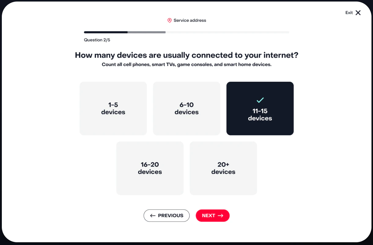
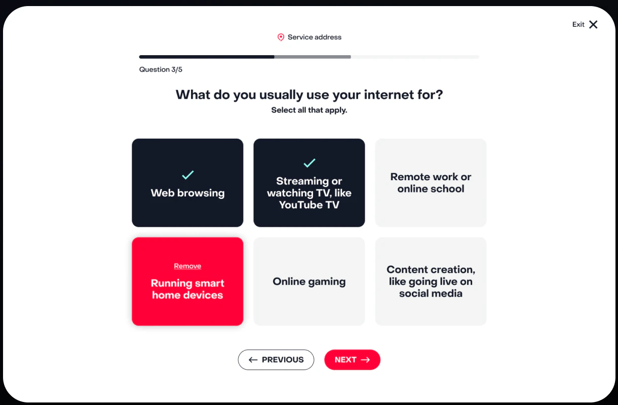
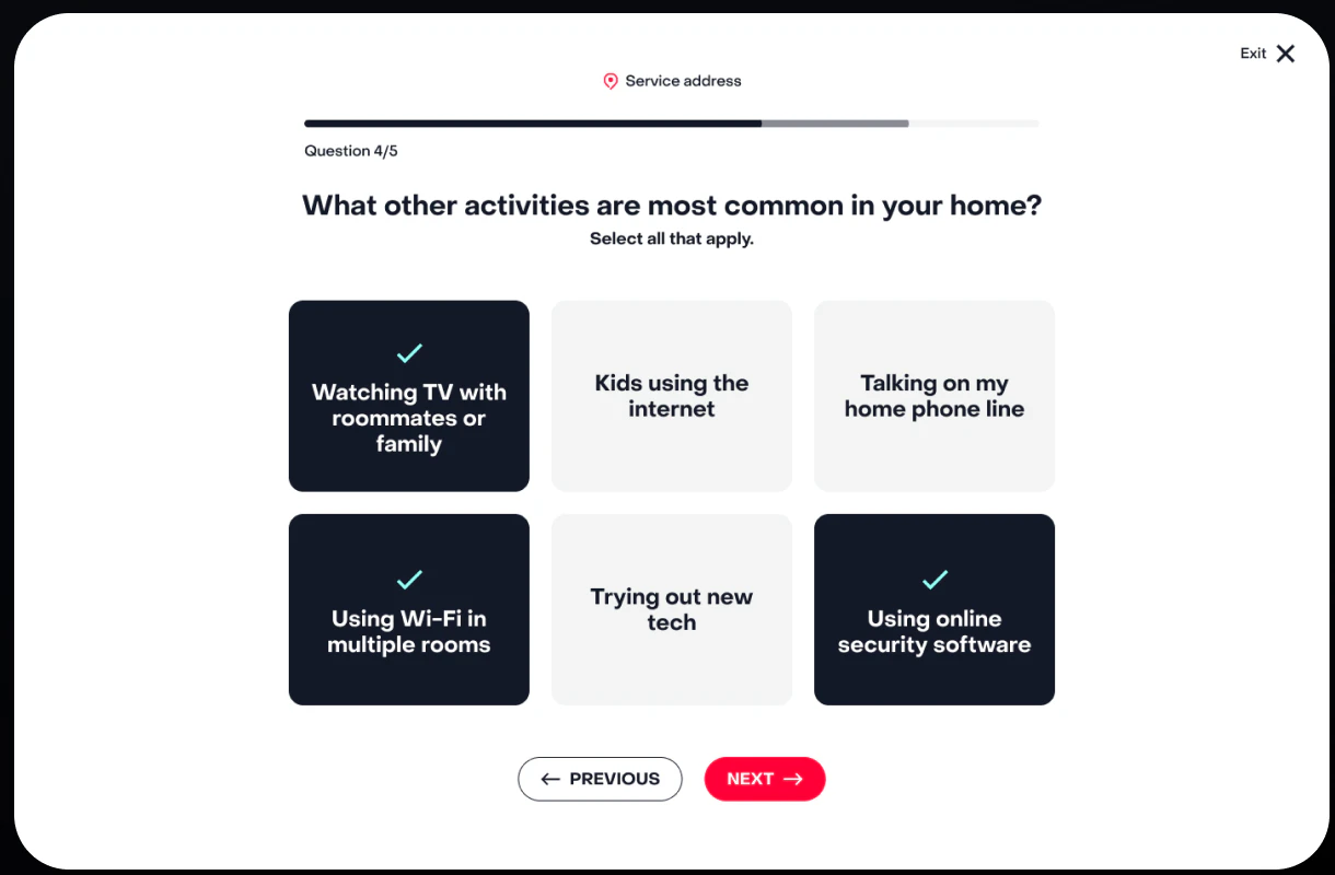
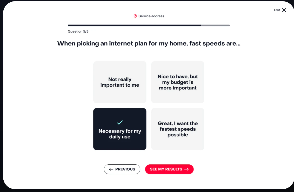
Ask only what changes the recommendation.
FRONTIER COMMUNICATIONS · PERSONALIZED COMMERCE · SHIPPED + REUSED
I designed and shipped a recommendation flow that starts with the household and ends with one clear plan and a visible monthly price. Two other businesses later adopted it.
01 · UNDERSTAND
02 · RECOMMEND
03 · CONFIGURE



IMPACT
THE INHERITED EXPERIENCE
The inherited page presented plans, promotions, features, and add-ons at nearly equal weight. Customers had to infer what fit their household, how services related to the plan, and what the complete order would cost. Prettier cards would not solve it. Customers needed help making a choice they could trust.
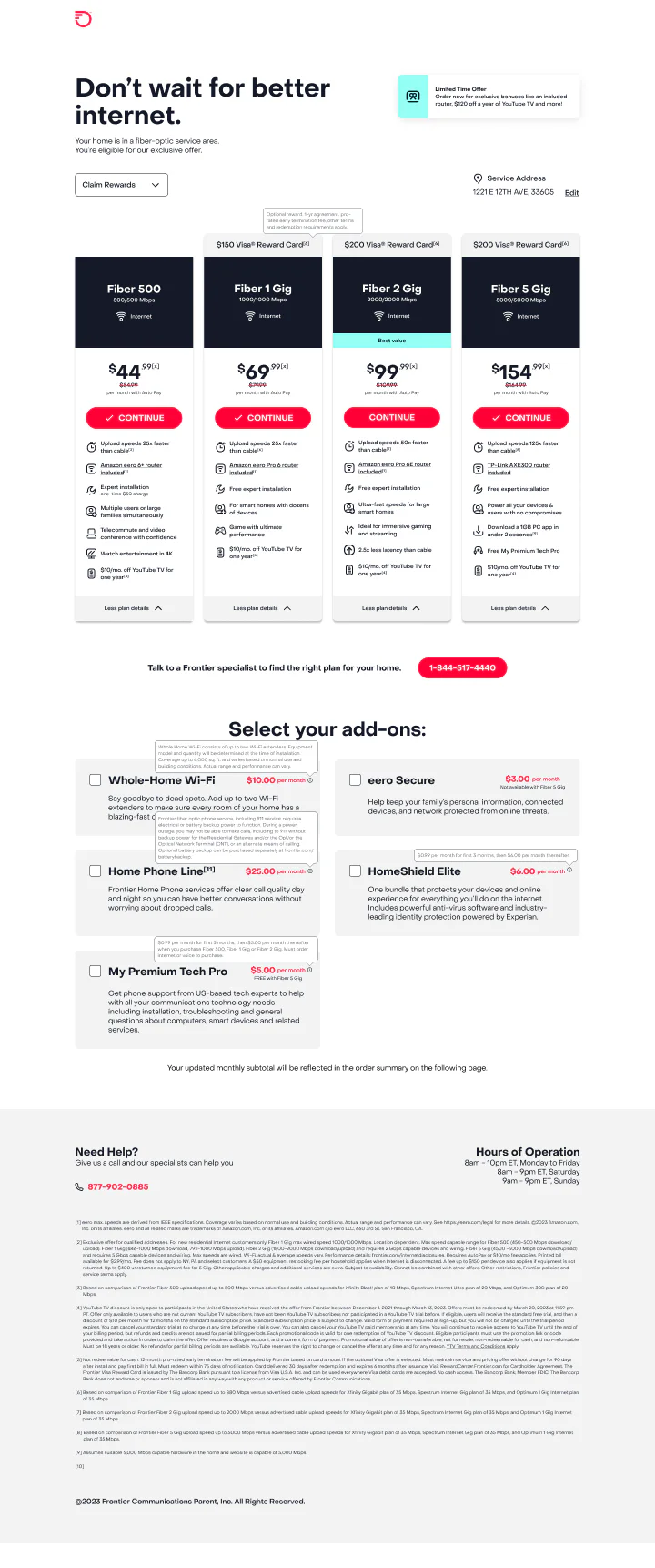
Plans, promotions, features, and add-ons all competed at once.
Add-ons appeared separately, with little help understanding when they mattered.
The real monthly total was scattered across the journey.
THE EXPERIENCE MODEL
The experience gathered only the information needed to make a useful recommendation, then made the logic visible and reversible.
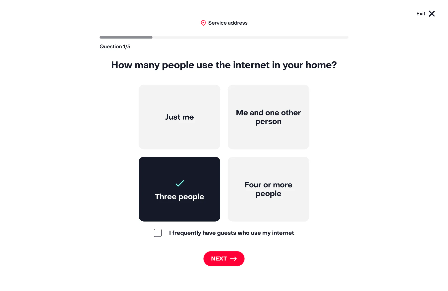
Ask about the people, devices, habits, priorities, and budget in the home.
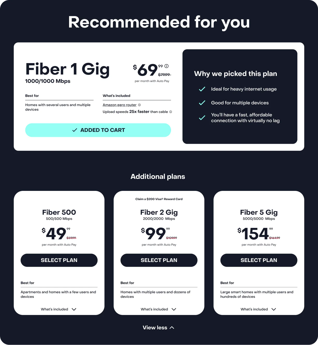
Recommend one clear fit and keep the rest of the catalog close by.
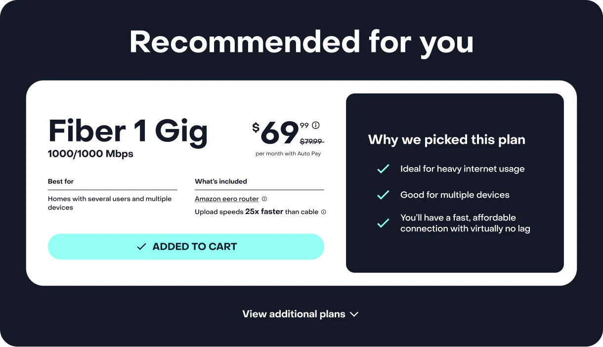
Show how the answers led to the recommendation, with alternatives still close by.
Bring in useful services when they matter and keep the full price visible.
The model replaced “compare everything” with a finite sequence: recognize your situation, receive a point of view, understand the tradeoffs, and build the complete order.
THE PIECES SHIPPED AS ONE CONNECTED PAGE
The shipped experience carried one recommendation into controlled alternatives, relevant services, and a persistent monthly total. Every choice remained in the same browser experience, so customers could understand and reverse a decision without losing context.
01 · FOCUSED RECOMMENDATION + CONTROLLED ALTERNATIVES
02 · YOUTUBE TV
03 · WHOLE HOME WI-FI
04 · HOMESHIELD

05 · PERSISTENT LIVE ORDER TOTAL
THE GUIDED FLOW
Each question used familiar language and showed clear progress, so people knew why it was being asked and how much was left.
RECOMMENDATION, NOT A BLACK BOX
The result named one plan, tied it directly to the customer’s answers, and kept alternatives available without undoing the guidance.
CATALOG → GUIDED ANSWER → CONTROLLED ALTERNATIVES
01 · INHERITED STATE
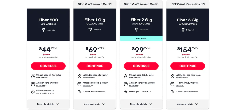
02 · FOCUSED RESULT
03 · EXPANDED DETAIL
THE ORDER AS A LIVING SYSTEM
Each service explained what it was for, showed the price, and responded immediately when selected. The persistent summary made every addition legible and reversible before checkout.
01 · YOUTUBE TV
02 · WHOLE HOME WI-FI
03 · HOMESHIELD
BEFORE SELECTION

AFTER SELECTION
INTERACTION COHERENCE
Mobile was not a smaller desktop composition. It was a stricter test of the decision model: one action at a time, progressive disclosure, and persistent order context.

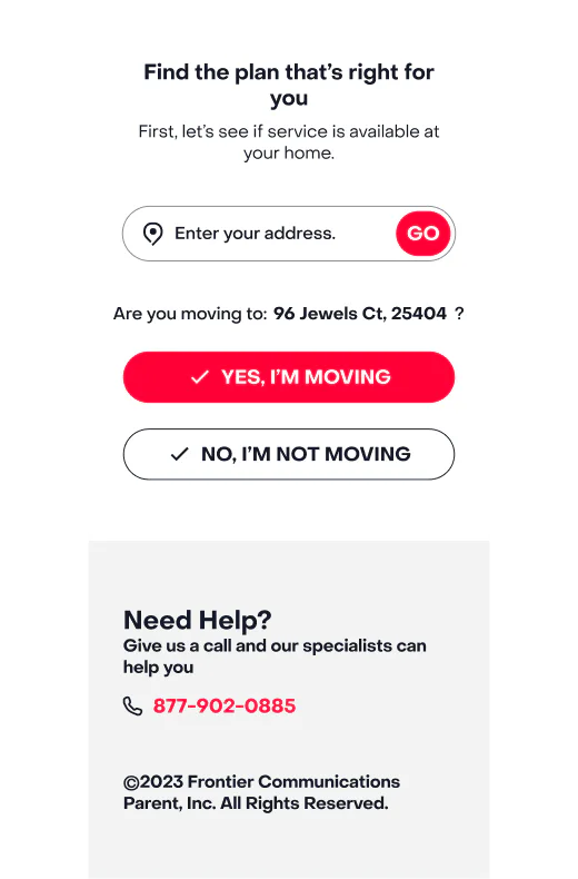
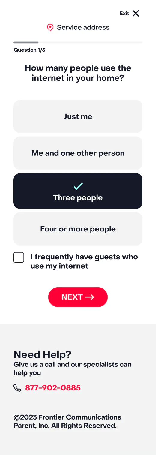
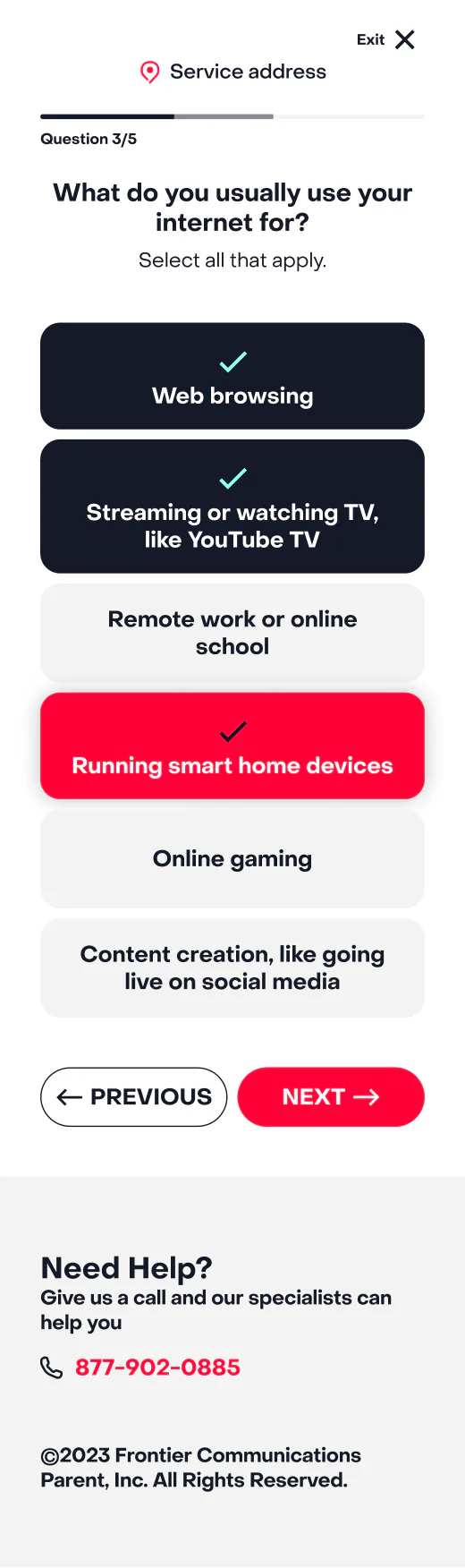
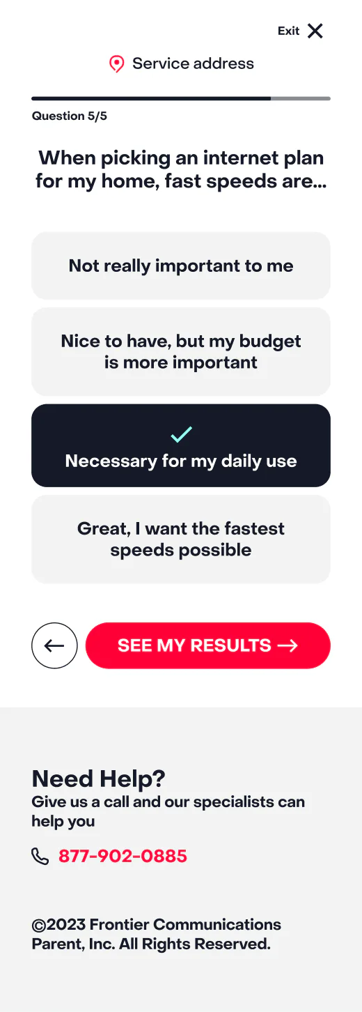
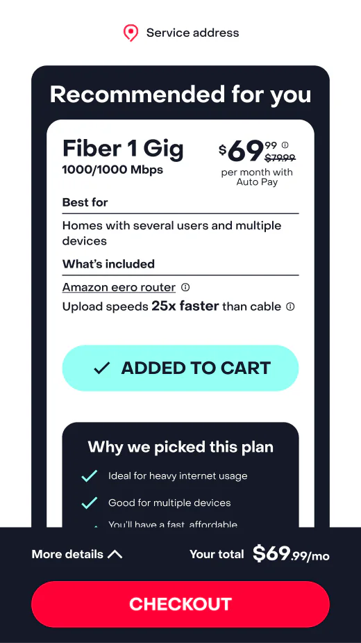
Each screen gives one action priority.
Visible progress keeps the flow understandable.
The monthly total remains legible as choices change.
THE SYSTEM REQUIRED TO SHIP IT
The system connected question content, answer states, progress, recommendation logic, alternative products, service states, pricing, order summaries, and responsive behavior.
Only inputs that changed the recommendation entered the flow.
One explainable default stayed connected to controlled alternatives.
Selections updated the same visible monthly total.
The hierarchy survived across desktop and mobile behavior.
THE HARD DECISION
The work faced resistance: adding questions, prioritizing one plan, elevating services, and increasing build scope all challenged the existing model. I built the major states, recommendation paths, service selections, and price changes into the prototype. It gave the team something real to review and kept the project moving while priorities shifted.
THE OUTCOME
The quiz was only the front door. The real work was turning the answers into one recommendation, showing why it fit, and keeping the total price clear.